The perception of space and the use of colour.
Colour is one of the most powerful tools in interior design, and its influence is magnified in small rooms where every surface contributes to the room’s overall feel.
Jun 29, 2026
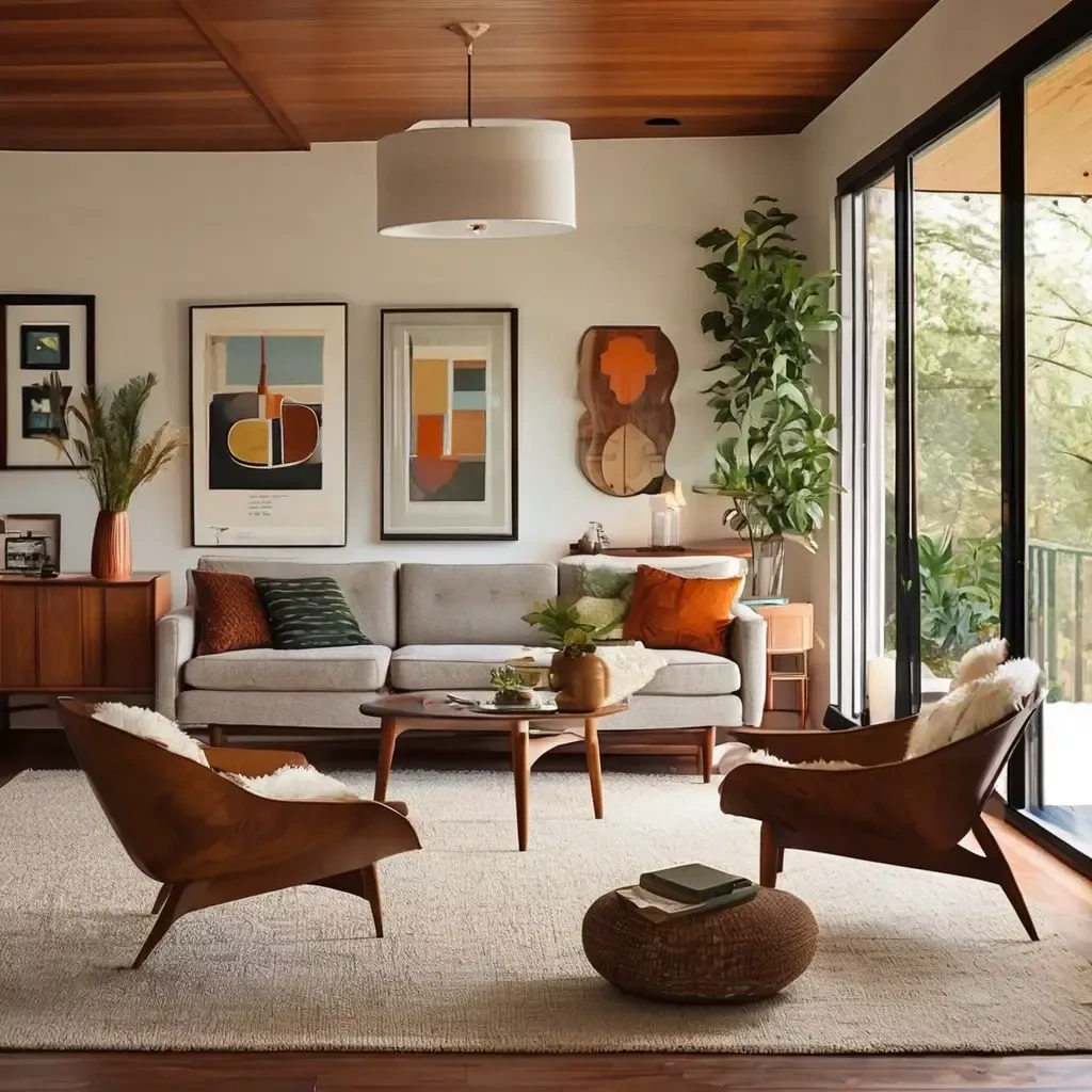
Colour is one of the most powerful tools in interior design, understatement!
Its influence is magnified in small spaces where every surface contributes to an interior’s overall feel.
Thoughtful colour choices make a compact space appear larger and brighter, establish mood, and create visual flow. Conversely, poor choices can make a room feel cramped, busy, or uncomfortable. Understanding how hue, value, saturation and light interact is the key to harnessing colour effectively in small interiors.
Alluding to space
Light-coloured surfaces have an ability to give an illusion of space. Whites, pale neutrals and soft pastels reflect light, causing walls to visually recede and corners to feel less defined. This effect reduces the feeling of enclosure and gives the eye room to travel, which is why painters and designers often recommend lighter palettes for small rooms. By contrast, deep, saturated colours absorb light and visually advance toward the viewer, which can make walls feel closer. That quality isn’t inherently bad—darker hues can create cozy, intimate spaces when used deliberately—but in small rooms they must be deployed with restraint.
Hue and saturation
The temperature of colour—warm versus cool—also shapes spatial perception.
Warm tones such as soft ochres and muted corals tend to advance and can feel enveloping; cool tones like pale blues and greens recede and convey openness.
Saturation matters too: highly saturated colours demand attention and can overwhelm a tight space, whereas desaturated or pastel versions of the same hues read lighter and less intrusive. For a sense of spaciousness, favour lighter values and lower saturation across the main surfaces.
Test the colour choice
Light conditions transform paint and fabric, so testing colours under different lighting is essential. Natural daylight changes through the day and will reveal undertones that small paint chips hide; north-facing rooms benefit from warmer neutrals to counter cool daylight, while sunlit south-facing spaces can support cooler tones.
Artificial light shifts colour the other way: incandescent and warm LEDs add warmth that can enrich earth tones, while cool LEDs can make warm shades look muted and cool colours pop.
A cohesive, limited palette prevents visual clutter in small rooms. Working with two or three coordinating colours—a primary base, a secondary shade and an accent—creates a calm, unified backdrop.
Monochromatic schemes, which vary tint and shade of a single hue, are particularly effective: they provide depth without breaking visual continuity, making a room feel larger.
Where contrast is desired, place it intentionally. A single accent wall painted a deeper tone can add perceived depth and draw the eye across the room, but it should be positioned to enhance perspective (for example, at the far end of a rectangular room) rather than interrupting the visual flow.
Using architectural features
Trim, ceiling and architectural details offer subtle but powerful opportunities to manipulate perceived space. Painting trim the same colour as the walls reduces hard contrast lines and produces a continuous field that feels more expansive. Painting the ceiling a lighter tint than the walls visually raises the room, while a slightly darker ceiling can create a sense of intimacy—but in very small spaces, sticking with a pale ceiling is a safer choice to keep the room feeling open. Finishes matter as well: satin or semi-gloss on trim and furniture can reflect light and add depth, but high-gloss across large wall expanses tends to highlight imperfections and draw attention to uneven surfaces.
Placement with other elements
Colour placement relative to furniture and textiles affects perceived mass. Large pieces in light tones reduce visual weight and open the floor plan, while reserving darker or more saturated hues for smaller items—pillows, lamps, an accent chair—adds personality without crowding the eye. Curtains, rugs and cushions can be used to extend the palette and reinforce continuity; matching or closely coordinating these textiles to wall tones prevents visual fragmentation.
Colour as function
Different functions call for different colour strategies. Bedrooms benefit from soft blues, muted greens, or warm neutrals that promote restfulness.
Living rooms often need a flexible, sociable palette—neutral foundations with layered accents that can be changed over time. Home offices tend to thrive with cool, focused shades like light greys or blues, punctuated by an energetic accent to prevent the space from feeling sterile. Kitchens and bathrooms often favour bright, clean whites or very pale tints that enhance the sense of hygiene and light; small bursts of colour in tile, appliances or accessories add charm without overwhelming the space.
Colour is a low-cost, high-impact way to transform small rooms. When chosen and placed with intention—respecting light, value and the room’s function—colour can broaden sightlines, balance scale, define mood and tie every element into a coherent whole.